|
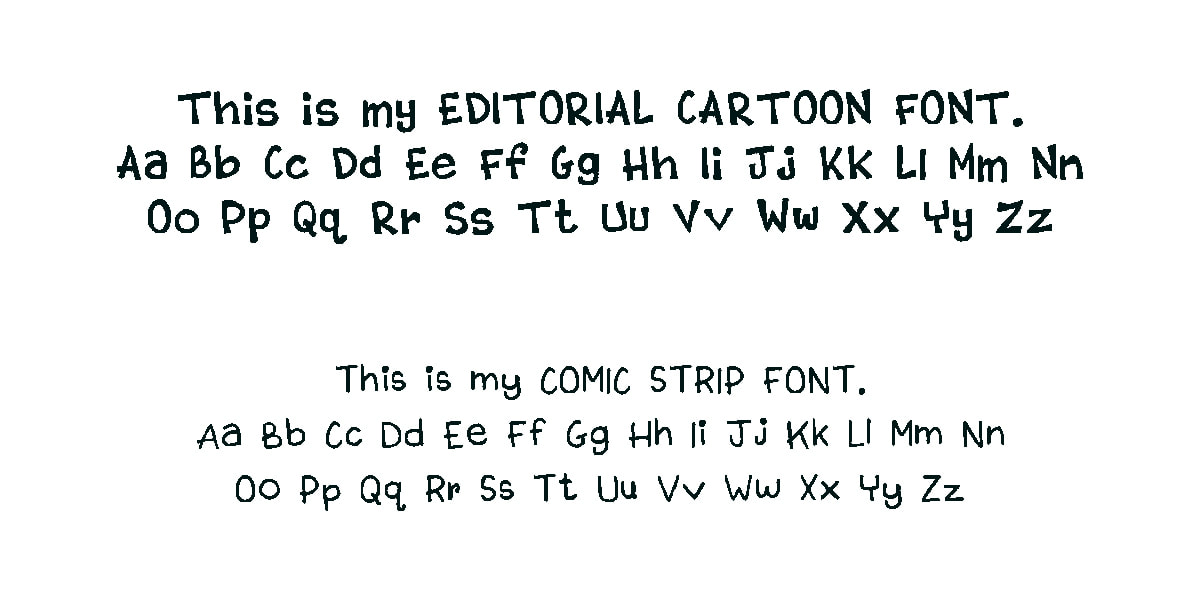
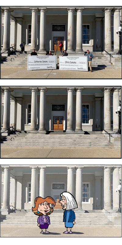
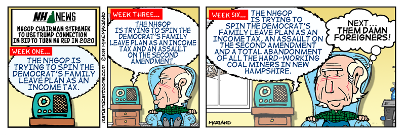
As I've explained previously, I'm having a bit of trouble drawing these days. Pencilling is fine - I can go loose and free, but when it comes to inking the precision required is a bit tougher with the tremor and arthritis, therefore my two webcomics as well as my current editorial cartoons have become hybrids of drawing and Photoshop trickery. I don't hand letter anything in these cartoons anymore. It's all done in Photoshop. I use commercial fonts for the strips but for the editorial cartoons I use fonts made from my own hand lettering using Fontifier. Now I can just type it and wa-la - it's still my lettering. Some of the spacing between letters comes out a bit funky and I have to adjust it by hand but other than that it works fine. I rarely use the comic strip font but it's there if I decide I want to use it. I'm always on the lookout for good state house backgrounds to use in the UP on the HiLL Violet Finch strips. I saw this one the other day on Twitter - loved the contrast with the deep shadows. So here's an example of that hybridizing... Top: the original. Middle: I removed all the people. I'm getting better at this, but you can see some repetition in the steps where I cut & pasted. I don't have any fancy apps for this I just do it with cut, paste & blur. Bottom photo shows how it might be used in a comic strip - I ran it through a paint dab filter and dialed back the saturation so the figures pop out more. Art geekery from an old dog learning new tricks.
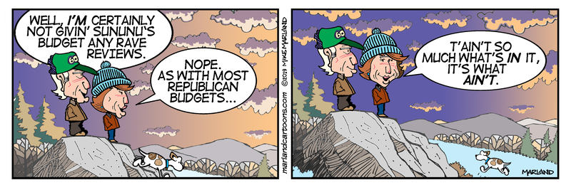
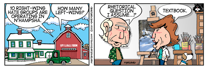
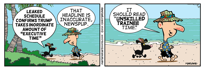
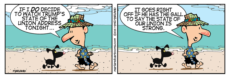
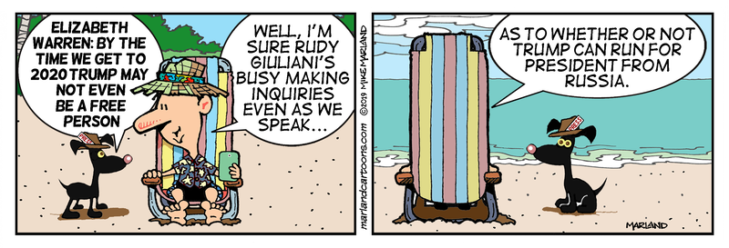
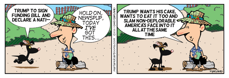
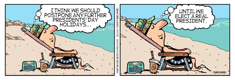
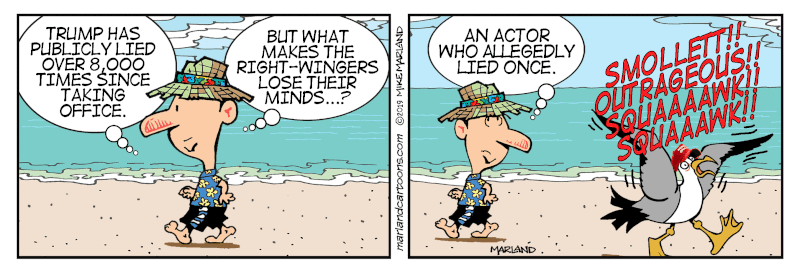
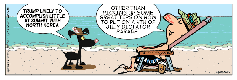
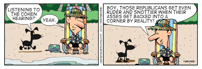
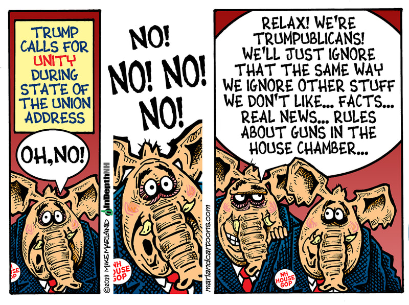
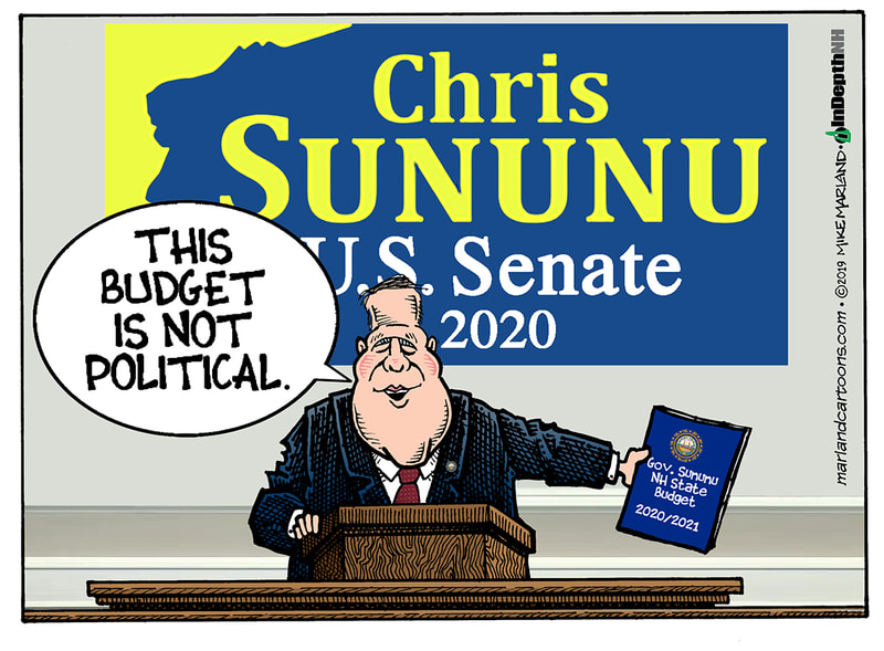
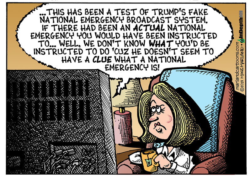
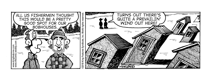
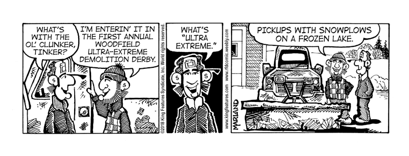
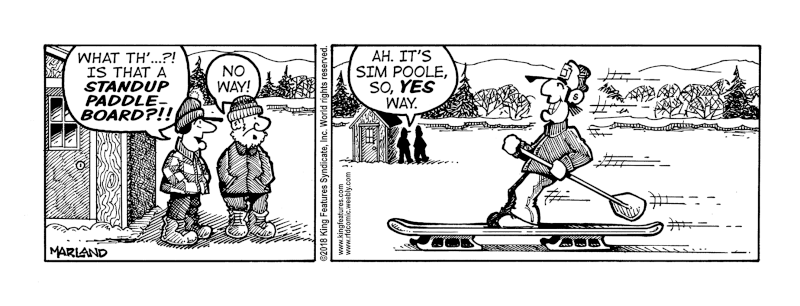
-MM February FunniesYou can support The Beach here: paypal
-MM |
Mike MarlandCartoonist Archives
February 2021
Categories |









 RSS Feed
